Blog Archive

Friday 6 January 2017

Painting leaves in acrylics. Contemporary style.

I have done 2 paintings of leaves in a bold contemporary style.  The paintings are on canvas and are painted in acrylic.

Here are the finished paintings, followed by a step by step account of how they were painted.


I did the top painting first. This is on a very large canvas. This one was painted for myself, and hangs on our dining room wall. The second one was, obviously, inspired by the first one, and is for sale.

So here goes....Firstly the top painting. I randomly painted some lines of paint on a canvas. Just to get a feel of the colours I wanted to use. 


  Next I  painted in some leaf shapes. As you can see there is no evidence left of my initial background. I decided I wanted wider bands of colour behind the leaves. I also wanted to place background colours so they contrasted with the leaves above them.  

The leaf shapes were kept simple. I just painted them straight on, making it up as I went along. I tried to get them balanced and facing in different directions, so it did not look too flat.


My next stage was to add a bit of structure to the leaves. I put some white lines on to show the veins of the leaves.  I started to add additional areas of colour over the whole painting, using colours just a bit lighter or darker than the existing colours.  I wanted to break up the surface and add some "movement" to the work.


  I then decided to abandon the vein lines on the leaves as I thought they were too dominant.  However, the leaves are subdivided like that, but in a more subtle way. 
I have softened and blurred the edges of the background colours, so they blend in to each other.  I added a bit of extra white to many areas.


I am working on the final colours, I decided to reintroduce more yellow, as it seemed to have lost its impact.  I painted the sides in a terracotta colour. 

 The final painting.


Having completed my first painting, I started working on another, This time I wanted a textured background. I created this with crumpled tissue paper. This is applied by mixing it with PVA glue and a little gesso, It dries to a very firm and strong surface. it takes quite q few hours to dry though!!  I then painted the whole surface with  red paint.


My next stage was to start planning some leaf shapes.  This is a much smaller canvas than my first one, so it does not take so long to do!!


Following on ....adjusting the leaf colours and adding some contrasting background bands of colour.


I do not have any more in between stages photographed, so here is the final painting.  I have added many layers of additional paint, indicating the structure of the leaves, and using contrasting areas of colour on both the background and the leaves.


  This one is for sale. It will be on my Artfinder page, or you can contact me directly.


Wednesday 10 August 2016

Painting a contemporary picture of a tree. Step by step,

Here is a painting I  have just completed of a tree, in acrylics.  I shall take you through the process of creating this step by step.


Firstly I put some bold stripes of paint on to a canvas. This just sets the scene for the idea. I know it will change a lot!


Next I  add a rough outline of a tree and have a think about how I might do the foreground.


My next stage is to work a bit more in to the shape of the tree, and to add some extra dots of paint ( mainly yellow)  across the sky and tree.


I then decide to add a light area at the bottom of the sky. This gives depth to the work and draws your eye in to the painting. I have also added white paint dots across the whole sky area.


My next stage is to rethink the foreground.  I thought the overall effect was too repetitive. So I have considered a shadow area under the tree and some alternative coloured foreground sections. I have introduced the colour purple to the front of the work. I am still not convinced this is right though! 


So I am now playing with the idea a bit. I have subdivided the foreground in to more sections. I use a range of colours and different sized dots to create texture to the surface.


I now expand the number of branches on the tree. I blend the dots of the sky in to the tree. My aim is not realism. I am exploring mixing patterns with nature.


As I work toward completion I put variations of tone across the tree, sky and foreground. This is fairly time consuming as the detail is worked in small overlaid dabs and dots of paint. To avoid smudging you need to let each layer dry before starting on the next. I add a subtle texture to the trunk of the tree and lower branches. I remove the shadow area under the tree, as it just made the trunk look longer, and was not obvious as a shadow!  I put a few gold and bronze dots through the branches, although this is not too obvious unless the light catches them. However, it gives a glow in certain lighting conditions!


My painting is complete.


This will be put on sale through Artfinder . Please use the link on the sidebar to have a look.

I have also done this painting which is a similar style.


Tuesday 19 July 2016

Painting a contemporary impressionist landscape. Step by step.

Here is a a step by step guide to how I have painted this contemporary impressionist landscape.


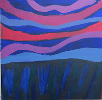
Firstly I chose a square canvas and painted some paynes grey across the bottom. I then and added some waves of paint across the top half.  I am using acrylic paint.

  Next I  filled in the gaps with some deep blue.


My next stage was to increase the swirling waves of paint at the top, with some pale pink and blue. This is to be the sky.


I then start to add some dots of paint. I use the same pale pinks and blues over the darker colours. I also add in some white.  It is important to keep the dots fairly even, so they look like circles not jut random blobs!  You need to find a good brush for this.  Also the circles sit next to each other, rather than overlap.


The following stage is just to increase the amount of dots. This does take time as you need to let one layer dry before you put on the next. It is just too easy to smudge them otherwise.  I have started to put a few trees on the horizon. I use a thin  size 2 brush for this.


I then go on to put more trees across the horizon. I vary the size of them, and allow for some to be clumped together and some more separate. I have started to think about the foreground now. I have also added wave shaped stripes. The colours are blues and greens. I have added a hedge across the fields too.


I then thought about the light coming through the trees and added more white to the top layer of the land. I added a gate to give some interest to the hedgerow.  I have worked in to the foreground using dots and small blobs of paint. I have allowed for overlaps here to give a different look to the sky.  I have added a few flowers in the foreground.


I continue with fine tuning the painting. I have removed a few of the trees on the right hand side, as I liked the look of the light coming through.  I have added a shadow area below the hedge.  I have started to add a bit of detail to the flowers at the front and work the background around them.


The final painting. I have changed my mind about the flowers, so have painted them out and reworked the bottom of the painting.


This painting is for sale on Artfinder.     Have a look by clicking here

 I have also got a similar one on the Artfinder site. The one below is a mounted original ( not a canvas)  that you would need to buy a 16 x 20 inch frame for it. It is painted in the same way, but just has more yellows in it, and a slightly different composition as it is rectangular. It also has dots to represent wildflowers in the foreground. 
  Have a look by clicking here


Tuesday 1 March 2016

Some more paintings of zebras.

Following on from my previous post, I have done some additional zebra paintings. So I thought I would show them to you!


Here are two zebras on a hot orangey red background. The background is really just a pattern, but a lot of people have said it looks like long grass.  That's a fair comment, but was not what I actually intended.  The zebras are fairly traditionally coloured, unlike some of my painted zebras!!  Although  reds, oranges and pinks appear as small dots on the shaded areas, of the zebras, to link it all together.


As I said, not all my zebras ate traditional colours. These two young ones have been painted in bright yellow and pink. Why not? !!  The background is a style I use in so much of my work.... Lots of overlaid dots.


I sometimes rework my ideas, with different colours or with just some elements of a previous painting.   This one is taken from the previous painting. I decided to separate the zebras and make a feature of just the pink one. I have brightened him ( her? ) up a bit, and put on a stronger background for contrast.

If you missed my previous post,  here is the painting I featured. ( I showed this one step by step how it was painted).


Here is another version of it, below. It is in reverse. I traced off the outline, to save time drawing it all out again..hence the reverse!! 


This one is more colourful with totally non realistic zebras.  
It is sometimes interesting to rework your paintings, to see them in a different way.

I haven't posted on this blog for awhile. I have been concentrating on my floral work. This all goes on my other blog rozartz contemporary floral paintings. There is a link to this on the sidebar.  However, I am now doing more work that is not floral, so there will be more featured on this blog.

I am now selling my work through Artfinder. I joined a couple of months ago, so it is all a bit new. Some of these zebra paintings have recently been put on there.


Wednesday 19 August 2015

Painting zebras in acrylic. Step by step.

Here is one of my latest paintings.  I chose the theme of zebras, as I love the patterns!

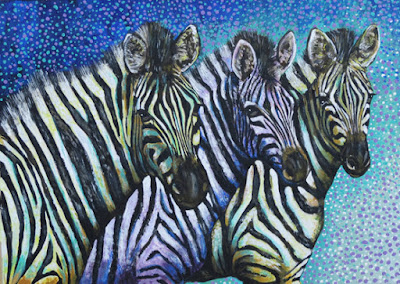
The finished painting is..... 


This is the story of the painting..........step by step!

A few years ago I went to Southern Africa. My youngest daughter Suzy had just completed a voluntary job in Swaziland. So I flew to Johannesburg to meet her. We then visited Botswana, Zambia and Mozambique. Three of the most amazing places I have ever been to. In Botswana we spent most of our time in the Chobe delta. Here the amount of wildlife you can see from land and river is incredible.  I took hundreds of photos. I have decided to do a series of wildlife paintings based on the trip.  I don't think I will do any paintings of her bungee jumping off the Victoria Falls though  ( but that is another story!! ).

So back to the painting. Firstly I sketched out the outlines.  This doesn't show too clearly, but you get the general idea,


 Next I put some colours behind the sketch to isolate the zebras. I thought a continuation of the striped theme would work at this stage. Although later I changed my mind.


Here you can see that I have started to paint in the zebras. I have decided to give them subtle pastel colours to make them more interesting....and I never had planned to do a totally realistic painting! 


Now I have completely changed the background. I decided the soft pastel colours did not work, I have added stronger shades blending blue through green to yellow.  I have worked quite a bit in to the actual zebras, doing facial details and shading the bodies.


  At this stage I changed the background again. The colours had become confusing. So I changed it to a selection of different blues.  If you look carefully you will see I also changed the right hand zebra from blue to yellow so as to contrast more with the background. The middle zebra is now more lilac than pink too.


The painting is nearing completion. I have decided to add a bit of texture to the background with dots. I have used shades of lilac and blue. I have also worked some additional colours in to the zebras bodies. I have added green to the yellow ones and blue to the lilac one. I have used a small brush to build up layers of thin lines to represent the zebras manes.This has to be done slowly so each layer has time to dry before the next one goes on, You want them to be distinct from each other and not blur.


The final painting. I have worked further in to the background to give a sense of contrast. I have tidied up small details around the faces.


Finally the work has been framed. I chose a black frame as it works well with the black stripes on the zebras.  


This painting will go on sale next month. I shall add the details on here when the venue is confirmed.  I shall also make it available as prints.

I am also working on another zebra painting. I have completed an elephant painting too. 
If you want updates please look at my Facebook page  Roz-Artz.    Please Like the page too!!

Saturday 18 July 2015

Art in Action 2015

I visited Art in Action yesterday. This is an annual arts event held at Waterperry gardens in Oxfordshire.

I have visited the show many times since it opened. As a painter I am a bit disappointed in the fact there seems to be less painting every year.  It is more arts than art these days!  There are plenty of craft displays and musical events, Even beekeeping and storytelling ! Plus you will never go hungry with a massive amount of the show now devoted to food stalls!! The most popular, with the longest queue was the vegetarian one...which is good from my point of view as a life long veggie!

I have taken a few photos of the Art I particularly liked at the show. This is mainly coloured pencils, painted pieces and art textiles.This is not representative of the whole show at all though. I really liked some of the ceramics and printmaking displays but have not photographed them. Some of the glass work was amazing too.

This is a beautifully detailed coloured pencil piece by Malcolm Cudmore  ( click here for a link to his website) which was on display at the stand for coloured pencils in the art materials and publications tent. There is some very intricate and well designed work on display, and for sale on this stand. 

A favourite of mine, by artist Este McLeod. Wonderful colours and composition.!!


Some clever, intricate mosaic work by Amy Harman.

There is a tent devoted to Textiles. I was very impressed by this art textiles painting. Lots of layers of different fabrics and stitching all tangled together to give a very pleasing garden effect.


Another textiles piece. This one attracted me by the impressive feeling of light the artist has captured.

This one is to be found in the Calligraphy and Illustration tent. Shelly Perkins was my favourite artist here with her incredibly detailed studies of animals and nature.

Two paintings I liked for their strength of colour.
A selection of paintings by Lucie Shelbourne. Once again I am attracted to the strong use of bright colours. Its not surprising as all my own paintings are big bright bold colours too!

I love all floral and wildlife art so my favourite part of the show is usually the Nature in Art section. I particularly like the demonstration side of this area with plenty of artists actively engaged in painting, and happy to talk about their work.

So its worth visiting the show. The weather was kind yesterday, I have visited before when heavy rain turned the entire site in to a slippery bog, I have also been when it was so hot that inside all the tents was like an unpleasant sauna !

I am considering applying to be a demonstrator here next year, with my floral art.